There are many important aspects on a website that you need to consider to engage the customer. One of them is the contact page.
This is a fundamental element for the good development of your online business, but why? Well, the answer is very simple.
When a potential customer looks at your website and is interested, access the contact form to contact you. If this page is not optimized or unattractive, the lead can back down and end up without contacting you.
Therefore, having an optimized contact page is key to getting new customers and not losing any possibility of sale.
And how to do it? Don’t worry, that’s what Kiwop is for. ?
Here’s how to make a web contact page, what items to put in, and 5 good tips for having it optimized.
Go ahead.
What are you waiting for to get new customers with optimal contact forms? ?
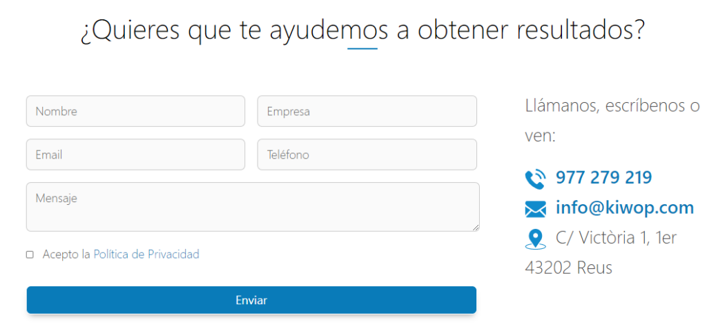
The contact form is essential to make a good contact page. It should be quick and easy for your potential customers to fill it out, but they may decide not to do so and leave the page.
In addition, you should try to have the necessary fields and not ask for too personal information.
The highlights it should contain would be:
Also, you can use the option to ask them to leave your phone and call them to communicate more directly.

You must inform users who fill out the contact form that you will not use their email to sell it to third parties. Explain that you’ll use it for your database.
It also details the current laws you comply with, as is the case with the Data Protection Act. That’s how you show your most transparent face.
At the end of the form, include a call to action that finishes convincing your potential client to contact you. This element can be a button, a featured phrase, or an image. Take out your most creative side and put it into practice.
Once they’ve submitted the form and it’s already in your database, thank them for doing so. In this way, you will give your most human image.
Also, let them know that your form has been filled out successfully. No matter which way you choose to do this, but it’s important to let the user know that the shipment was successful.
One of the best content for your contact page and what best results it has is to place the buttons of your social networks logos with direct links.
Thus, they may know more about you, follow you, be informed of your news, feel about your community and end up consuming your products or services. This way, you can win new customers who are interested in your brand.

If you have one or more physical stores, add their addresses and schedules. Thus, if any potential customer is interested, they can go directly and find out firsthand about your business.

If you have real customer reviews, you can add them to your contact page. In this way, you will reinforce the idea that you are a good option to buy your products or services.
If these reviews come not from private customers but from companies with recognized logos, add them as well. This will inspire trust in users interested in you.
It is no more important what is said as the way it is said. You should know what to include in the texts of your contact page, but it is essential to use copy techniques to sell more.
By creating engaging texts that get the attention of customers interested in you, your sales possibilities will increase.
You have to get them to stay with you when they read you. And you will only achieve this by using copywriting on your contact form.

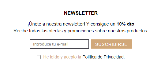
Once the user fills out a contact form, you should not send them hundreds of newsletters, emails, information about you or requests for opinions about their purchases.
Añade botones que digan que si los seleccionas, se le enviará este tipo de contenido acerca de tu e-commerce. In this way, you give the user freedom to know more about you and you don’t press them giving a brand image obsessed with selling.

To contact you, you must spend some of your time filling out your contact form. If you thank him for doing so, he’ll improve his image of you and think he’s done well by filling out the contact page.
If your contact page is full of information and requests for data requests, the user may see it overloaded and therefore feel overwhelmed and leave the page.
Determine what content you want to include in your contact form and create it based on it in a visual, clear and synthetic way. This way, the user will flow better on your Page.

Today, we access web pages from multiple electronic devices. Computer, mobile phone, tablet, and many more. Therefore, it is essential to create responsive designs.
If your user wants to access your contact page to fill out the form but the website can’t display it because it’s not compatible with the device they intend to do so from, you’ll probably lose a potential customer.
Therefore, your contact page must behave perfectly and adapt so as not to waste customers on usability issues.
You have already been able to check the importance of having an optimized contact page in your e-commerce. Also, you know what elements to put in, how to write them and 5 good tips for it to succeed.
Now it’s your turn.
Analyze which aspects of which we have told you are not present on your contact page, make modifications adding the special touch that characterizes your brand and… You’ll succeed!
Remember that if you need help or want us to solve any questions related to your e-commerce, we will be happy to do so. ?
Contact us or follow us on our Instagram profile.
At Kiwop, we are specialists in content writing, digital marketing, web development and e-commerce.
Cheer up and…
Optimize your contact page to convert more!
If you want to have the website you want or increase the online visibility of your brand, we know how to do it.
Shall we start today?
Leave a Reply