In another article we already talk about web accessibility in video format. In that article, our colleague Marien explained to you what web accessibility is, benefits and tips to take into account when designing and developing a website. If you haven’t seen it, we encourage you to see it first, as that article was an introduction. This article we present to you today is more intermediate.
Having good web accessibility basically implies that websites are designed and developed so that people with disabilities can use them.
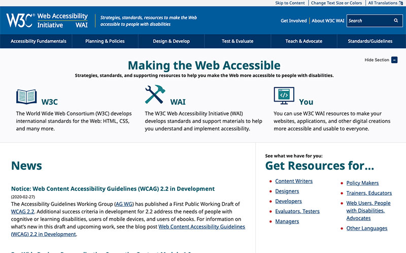
The W3C Web Accessibility Initiative (WAI)develops specifications, guidelines, techniques and support resources that describe accessibility solutions. They are considered international standards of web accessibility.

When devising the architecture and design of the web, it is more than open to accessibility. That is, you have to develop websites with accessibility in mind, so that you don’t have to make unnecessary corrections later.
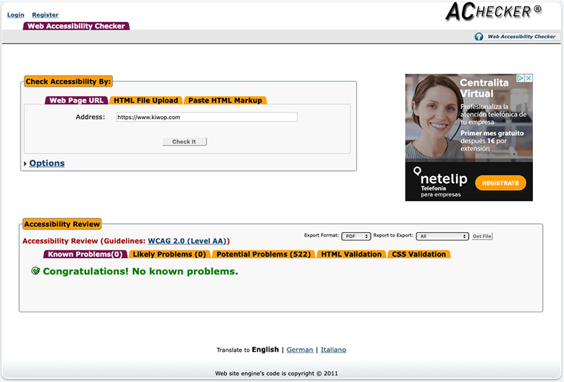
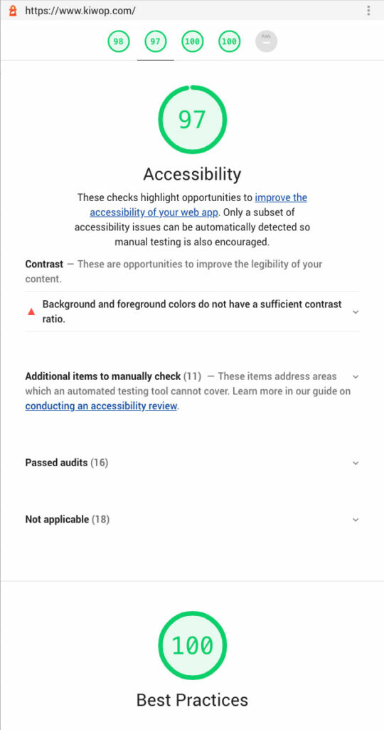
Once the website is layout, you have to do several analyses on the accessibility of the web. Apart from manually analyzing all the important points for a correct assessment, we will also help us with external tools for the realization of several tests to check their level of accessibility. Still, no tool alone can determine whether a website meets accessibility guidelines. You have to make a human evaluation with sufficient knowledge to determine if a place is accessible.
Tools can help us, but it will always take the intervention of an eye expert in accessibility to determine and apply the final solutions. Another idea and option is to test users with special conditions (color blindness, blindness and other disabilities) to confirm that they can navigate without any problem.
Examples of free tools could be:

It is important to note that although they have a relationship, the accessibility and usability of a website is not the same. Although both want to improve the user experience of web visitors, they don’t have the same purpose. So you have to know how to tell them apart.
To conceive of architecture and design taking into account web accessibility, it is important to:
All non-textual content must have text-formed alternatives. By non-textual content we do not refer only to images, with their corresponding “alt” attribute. We are also talking about icons, buttons, graphics, form fields, visual content (audio, video and multimedia), diagrams, illustrations, etc.
Text alternatives must convey the purpose or function of the element that provides an equivalent user experience. For example, a suitable text alternative for a search button would be to “search” anywhere in “magnifying glass”. This is a clear example where accessibility analysis tools would give it valid (since it would have an alt attribute), but an expert would see that it is a clear error since the icon function is “search”, even though “magnifying” is a faithful description of the image.
We will avoid images with text embedded within the image itself whenever possible, since neither search engines nor reading aids can still read texts within images.
It will be important to add the label attribute to all fields in the forms.
Links will have to make sense outside their context. Phrases such as “click here”, “more”, “more information”, etc., are ambiguous when read out of context. We will use appropriate phrases for links.

We will provide alternatives to tempo-dependent content (audio, videos and multimedia) such as audio description, subtitles, etc…
We will create content that can be presented in different ways without losing information or structure. Meeting this requirement allows content to be read correctly aloud, expanded or adapted to meet the needs and preferences of different people. For example, it can be presented using color combinations, different text measures, or different styles for ease of reading.
We will make visual presentation as easy as possible to perceive for people with disabilities, i.e. elements such as buttons, video players or others will be perfectly identifiable and executable.
Meeting this requirement helps separate the text from the background, to make the information more distinguishable. For example, many people with color blindness do not use any particular tools and rely on a suitable design that provides sufficient color contrast between the text and its surrounding environment. For others, for example, if audio from an audiovisual resource was played automatically, it could interfere with your text reader or assisted listening devices.

All the functionalities have to be accessible by keyboard, that is, you can browse the web without a mouse. Many people can’t use the mouse and rely on the keyboard to interact with the web. For this, you must be able to access all available web functionalities via keyboard, including form input controls and other user interface components.
We will not use any content that may cause user disruption. For example, you have to avoid visual effects with very marked color changes or with different shapes and colors that a priori could be very good, but that could cause epileptic seizures among others.
We will provide users with ongoing help in browsing, localizing content and position. Breadcrumbs are very important by users, since it places the page they are on in a specific context of the web.
Textual content has to be readable and understandable. You have to avoid the use of unusual words or, at the very least, provide definitions or a glossary of help from them.
We’ll present content in a predictable way, along with easy, intuitive and easy navigation. A good example is to always keep the same main menu on all pages, so as not to confuse the user. And if different menus are needed depending on the page, do it in the form of secondary menus.
It must also avoid possible frequent errors by users. We must give them guidelines and help when we require their actions. A good example would be that forms are checked which fields are required before the typical required field error appears.
We need to ensure compatibility with all web browsers, on all devices and with all technologies. We will do studies to determine if there are errors on any specific device or browser. All the new schedules that we add will go through a process of compatibility with all browsers and devices before applying them.
At this point it is important to note that the web has to be accessible not only for typical devices and browsers, but also for special devices that use some kind of assistive technology. We are talking about technologies such as JAWS (Job Access With Speech):a commercial screen reader provided by Freedom Scientific, or NVDA: an open source screen reader, ONCE Zoomtext or even browser extensions.
Once the website has been developed taking into account the 4 accessible design points mentioned above, in Kiwop we will proceed to write a report with all the problems encountered and their possible solutions. We say possible because for the same accessibility problem there can be several valid solutions. We will always recommend the best solution taking into account the corporate identity of each client and with our experience in accessible design.

Once we have approved this accessibility report, we proceed to the correction and re-examine it to determine that we have actually solved all the issues raised. We repeat this process until all web elements have at least the dual accessibility level A marked as a target.
Once all the elements have the minimum level of accessibility required, we analyze the requirements of the elements to rise to the level of triple A accessibility, and modify the elements that are feasible to improve.
Need an accessibility audit? Contact us!
If you want to have the website you want or increase the online visibility of your brand, we know how to do it.
Shall we start today?
Leave a Reply