Landing page.
Weird word, isn’t it?
If we translate it, it literally means“landing page”.
Maybe it’s the first time you’ve heard it, or maybe you’ve seen it somewhere before. Anyway, you probably don’t know what it’s about.
If we also talk about the key elements that it must include to be effective, you still feel more lost.
Don’t worry, here we are to clarify your ideas.
Throughout this article we’re going to explain what the landing page or landing pages, reasons to build a page of these, a detailed example of how they work, why they are a very powerful element for digital marketing strategies,italand what are the key elements to consider when creating one.
Oh! And since we really like visual examples (and we know that you will also be phenomenal), in the end we leave you some landing page of references from the online world to inspire you.
And without further delay, we start! 🙂
Let’s start at the beginning.
A landing page is a page that has a clear goal: to convert. That is, the user who visits takes a specific action.
On this page, users ‘land’ after they click on a banner or ad placed on another page on a website, or also through ads on social media or Google Ads. It can also be reached through Google’s organic search, if you want to optimize it with SEO.
Throughout the landing page, users receive information about the product or service promoting the banner orad.
Landing pages are not isolated elements in a business strategy. They have to be aligned with the digital marketing plan, and have a well-defined goal to know what you want to achieve with it.
Therefore, it is a way to promote your business on the Internet, attract leads and turn them into customers. And it is proven that it is a highly effective strategy to get direct sales or data of users who come to our website.
The goal is different on each landing page,and it has to be very well defined to then be able to measure whether it is getting or not.
Here are some of the main goals you can set when building a landing page:
Also, if the landing page is well optimized with SEO, more will appear on Google and help capture more leads.
Imagine that you are a user who is visiting our website and you start reading a blog post.
At the end of the article, there is a call-to-action button (CTA) where it says“ACCESS OUR WORDPRESS COURSE NOW!” As you are interested in the subject, you click to know more.
Then a new page opens where you find all the information related to the WordPress course. You read it, and in the end it tells you to buy it through another CTA.
This would be an example of direct selling through a landing page.
Another option would be that from our blog you would follow a CTA to download an e-book with the title“How to design a WordPress page in 15 steps”. This link would lead you to the landing page, where after giving you more information about the e-book, I would ask you to leave your data (usually name and email) in exchange for receiving the book by mail.
With this what we do is get your personal information to later contact you personally and in a personalized way, and in this way try to take you to the purchase of a product of ours or to the hiring of our design services in WordPress.
The main objective is that the user who enters our landing page will read the information that is on it and end up performing the action that we want.
To do this, you have to eliminate all possible distractions.
The main thing is to remove the menu and footer from the page,since there you can go many users. And what you’re interested in right now is that they pay attention to the product or service you’re talking about.
It is also important to remove external links to other pages (except for the payment gateway, in case direct selling is pursued).
They have to be flashy (and if they can contain the keyword by which you would want to position this page on Google, much better). Something that is very useful, and that at first glance is not very obvious and not everyone uses it, is the fact that we focus on the benefits for users rather than highlighting the categories of the product or service.
As we explained in this article about copywriting or persuasive writing,one of the main tasks that the copywriter performs is to write landing pages.
And why?
Very simple: on the landing pages we have a very marked target. We want to sell directly or we want to get the data from potential customers to in a second phase sell something to them.
And with a simple text that doesn’t connect with those people you’re not going to get much. We need to write about the product or service we sell so that potential customers feel appealed and see that acquiring it will solve a problem they have or satisfy a desire.
It is one of the main elements of landing pages. It must be on an eye-catching button and be concise and direct. It has to be the element that, if you zoom out to the page (the smallest beam), stand out more of all of it.
It is recommended to use action and instantaneous verbs, such as “BUY NOW” , “ACCESS NOW TO COURSE”.
If it is a long landing page, it is better to use more than one CTA. This reminds the user that they can buy or do the action you want.
Only the essential information must be asked not to be made heavy. It’s a good way to get, for example, emails, and be able to send newsletters to leads.
Ideally: put forms saying “The name your friends call you” and here “Your best email”.
Very, very useful to build trust. Ask former customers of yours, co-workers, etc., to write a little testimonial about what the product you offer is like, what it’s like to work with you as a professional…
Put them in a very visible and attractive way, adding even pictures of people to make them look more real.
They provide a security bonus to the user, since you imply that nothing is being played.
In addition, it gives the perception that your product or service is very good, since you have the confidence that it will be tested and returned, something that would actually harm you.
However, this element is not for all types of product and service, obviously.
The photographs of the product or service offered must be very illustrative and graphic. They must have good quality and allow the user to enlarge and rotate them.
This conveys trust and security.
Videos and images must be optimized for immediate loading.
Users have become more demanding from mobile and we are a little more patient in front of the computer screen.
Accessing from mobile requires efficiency, therefore, the waiting time must be less than that of a computer.
First you must load the most important content and then the additional items.
When you use a mobile template that is not ready to develop on these devices, the non-visible code on the page can weigh too much and delay loading the content. We’ve got to keep an eye on him.
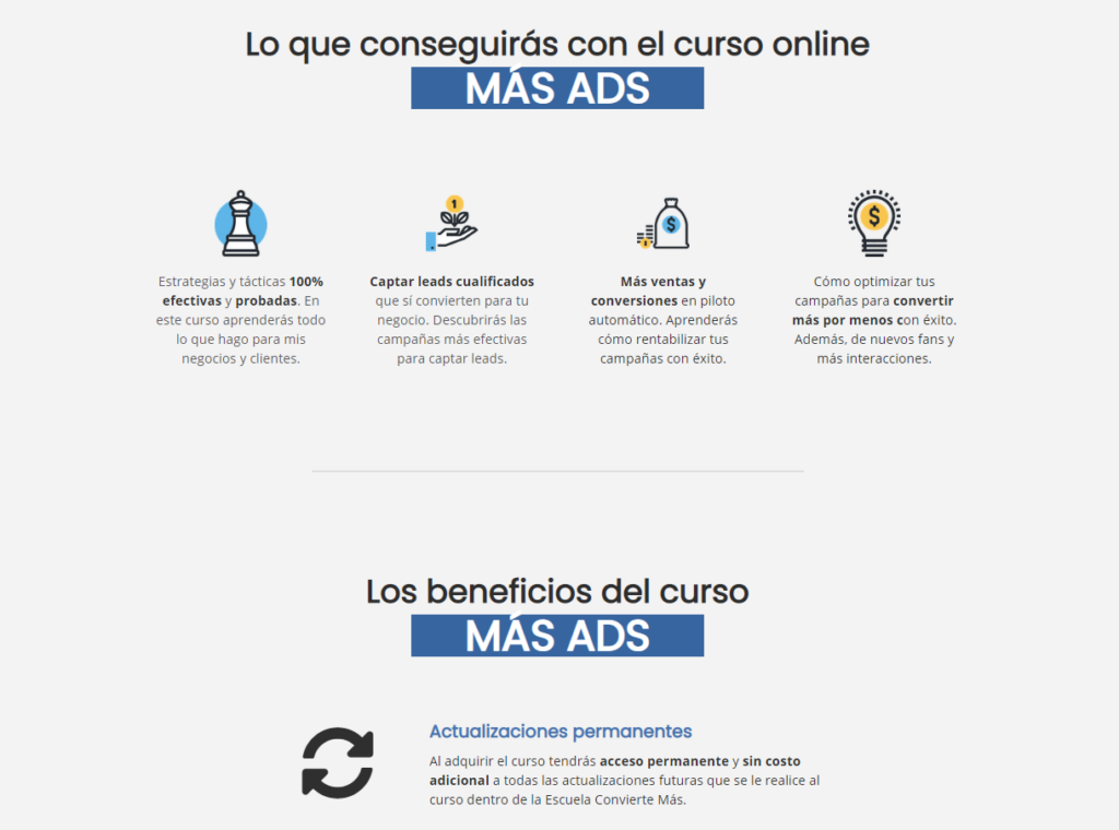
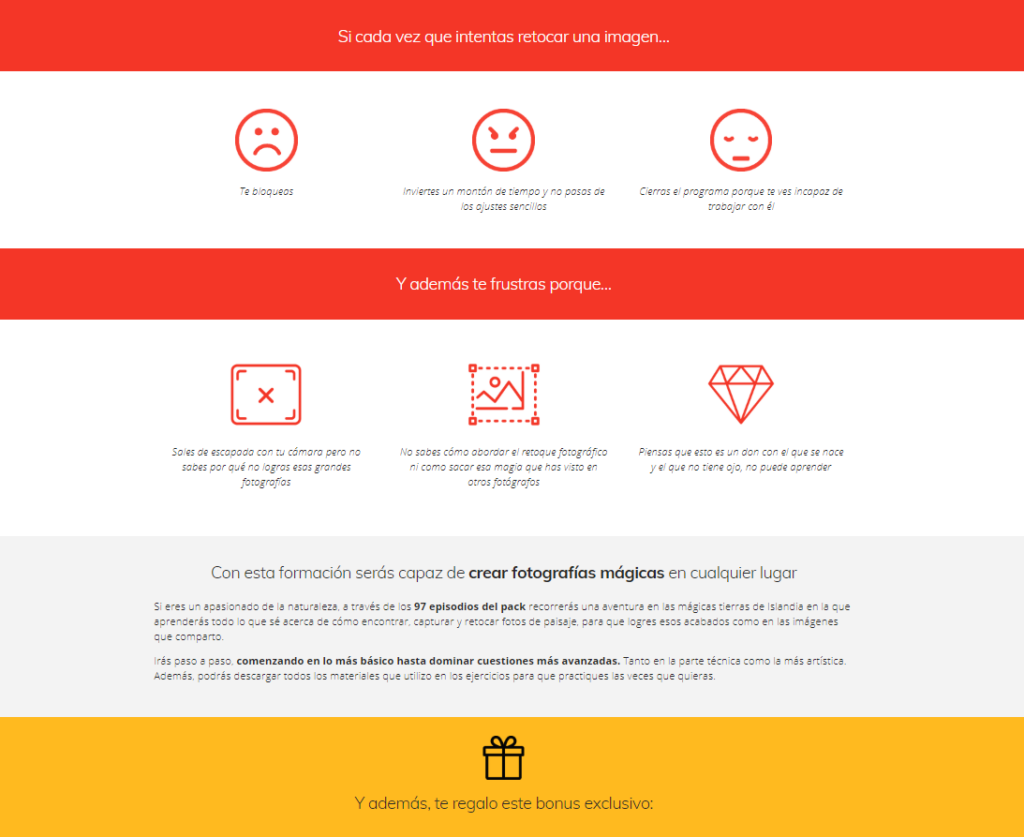
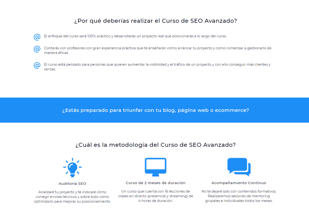
Now that we’ve gone over the most important elements that a landing page should contain, let’s look at real examples.
And they’re not just any examples. We have chosen landing pages of authentic references in the world of online business. We hope you will be inspired!


Well, at this point, we hope that the word landing page is no longer a strange thing for you and that you have a much broader view of what can be achieved with it.
Remember that you have to keep in mind each and every one of these points when designing a landing page. With a clear and visually powerful structure, the user’s attention will be captured so that he ends up performing the action you want.
If you have any questions about landing pages, do not hesitate to ask us!
If you want to have the website you want or increase the online visibility of your brand, we know how to do it.
Shall we start today?
Leave a Reply